The Standard

Design only earns its keep when it works. Below you'll find several conceptual projects and my own active landing page. Each showing how I translate a distinct brand into a clean, high-performing web experience.

All of it is made to the same standard.

Concept Sites

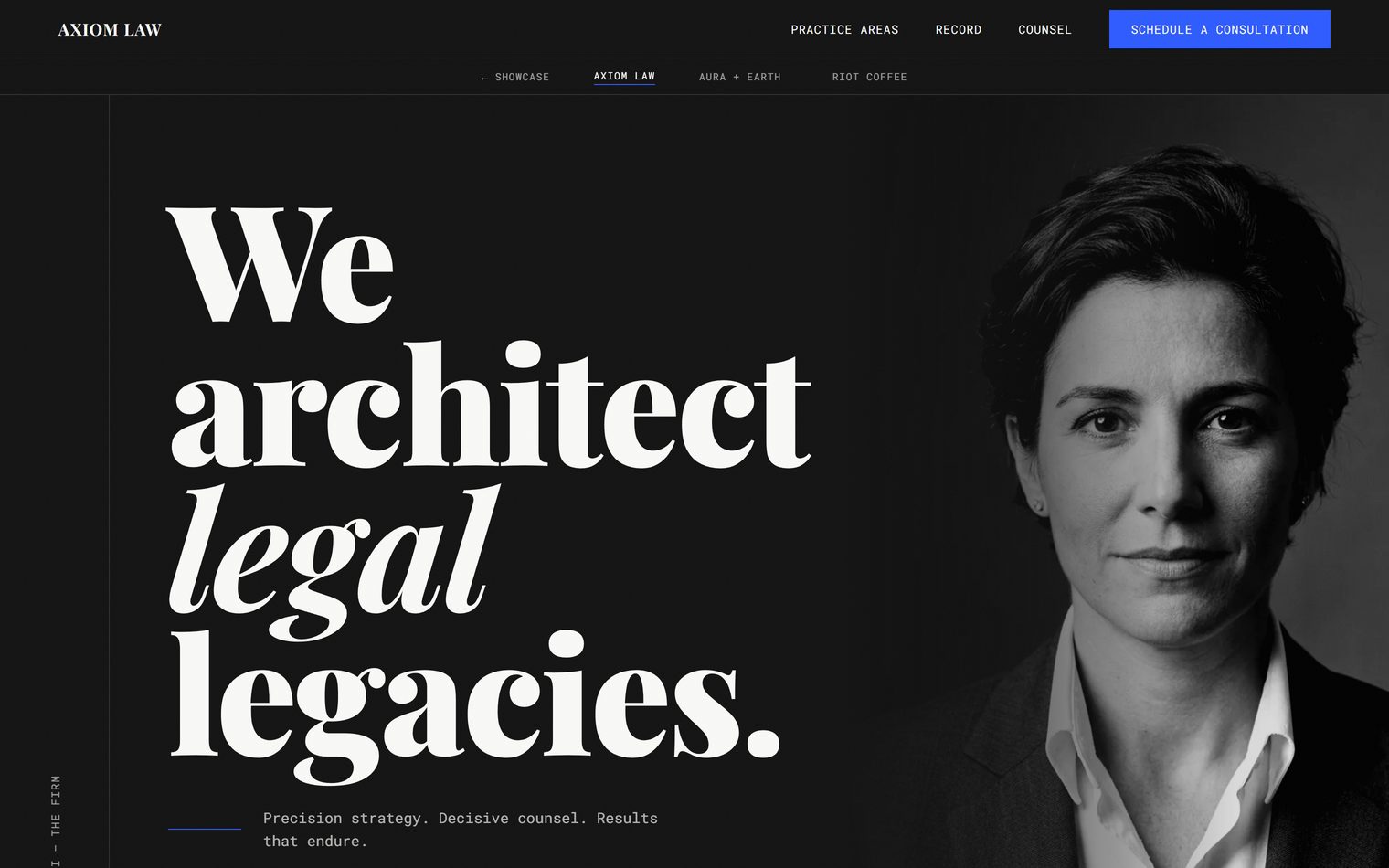
Editorial law firm website with monochrome palette, serif typography, and content-first layout against a clean white background.
Concept Site

Axiom Law

Visionary | Law & Authority

A concept for a firm where authority is quiet, steady, and easy to trust. The editorial layout and carefully chosen typography create a sense of calm, guiding visitors through the content with clarity and intention. Every element is considered, not to impress, but to make the experience feel effortless. Built with hand-written code and semantic HTML, it reflects the same thoughtfulness and integrity clients look for in the people behind it.

  • Monochrome palette paired with serif typography for a calm, grounded presence.
  • Content-first layout that keeps the focus on what matters most.
  • Designed to help visitors feel informed, comfortable, and confident in taking the next step.
View Axiom Law
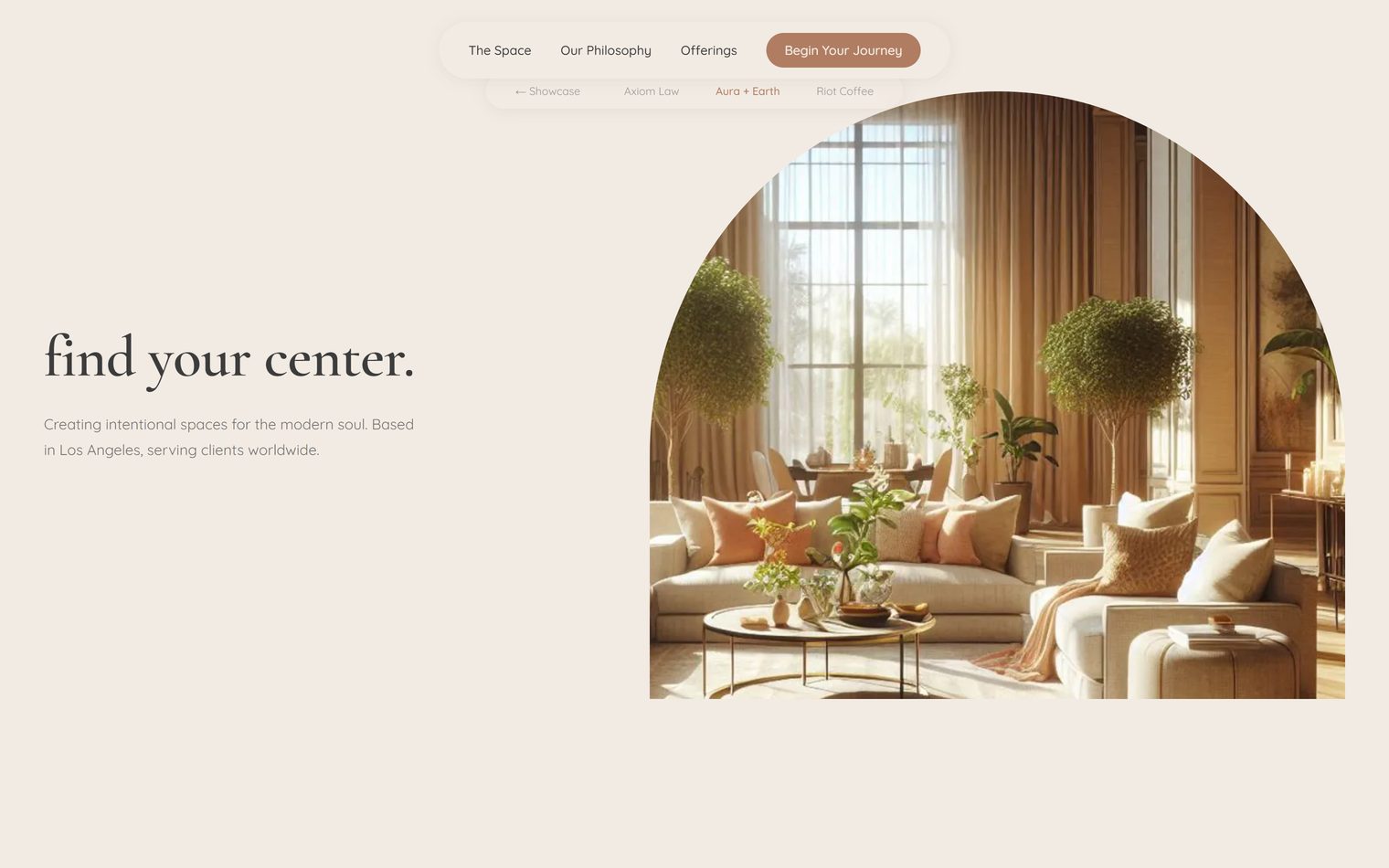
Interior design studio website with earth tones, organic shapes, and a bento-grid gallery with warmth and natural texture.
Concept Site

Aura + Earth

Sanctuary | Interior Design

A concept for a studio where the digital experience feels as intentional as a well-designed space. Earth tones and organic shapes create a sense of warmth and grounding, giving the brand a tactile, lived-in feel. Each layer is thoughtfully composed to feel rich without becoming heavy, balancing visual depth with speed and ease. It's designed to feel inviting from the first moment, and effortless to move through.

  • Organic shapes and natural textures create a warm, grounded presence.
  • Bento-grid gallery curated for high-impact visual storytelling.
  • Crafted to make a premium service feel approachable, human, and easy to connect with.
View Aura + Earth
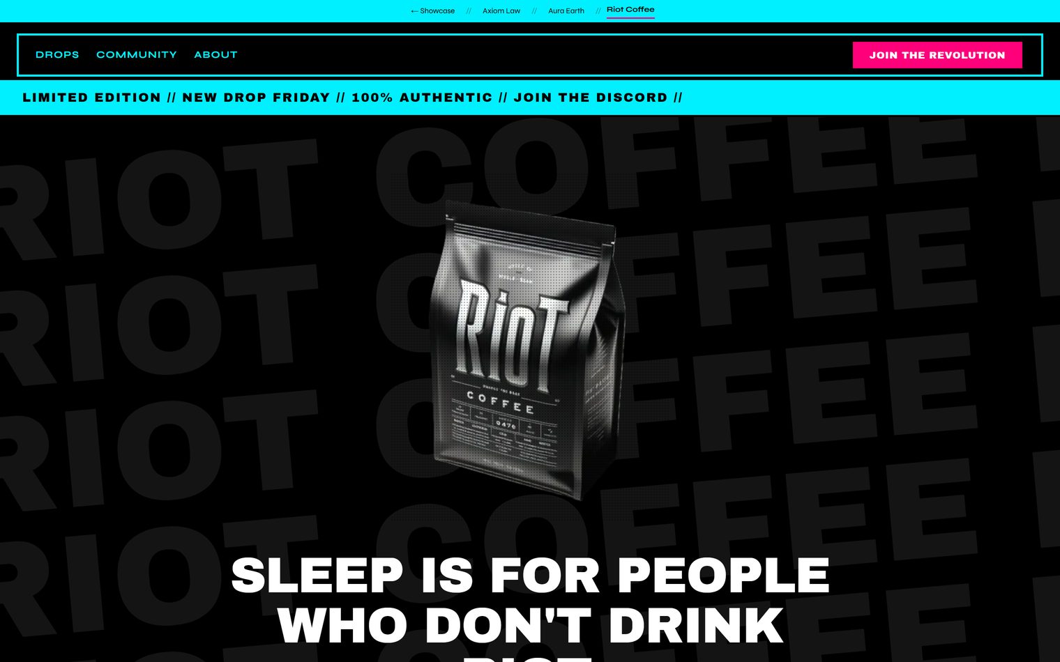
Neo-brutalist coffee brand website with neon green accents, hard shadows, and kinetic typography on a deep black canvas.
Concept Site

Riot Coffee

Pulse | Coffee & Culture

A concept for a brand that treats every roast like a streetwear drop. The experience carries that same sense of anticipation, with bold contrast, sharp shadows, and motion that keeps things feeling alive. Even with all that energy, it stays grounded in accessibility, with animations that respect user preferences and performance that keeps everything fast and fluid. It's built to feel exciting, but still easy to move through.

  • Neo-brutalist layout with neon accents set against a deep black canvas.
  • Animated marquees and halftone effects that bring a sense of movement and rhythm.
  • Designed to turn community energy into moments people want to be part of.
View Riot Coffee

Landing Pages

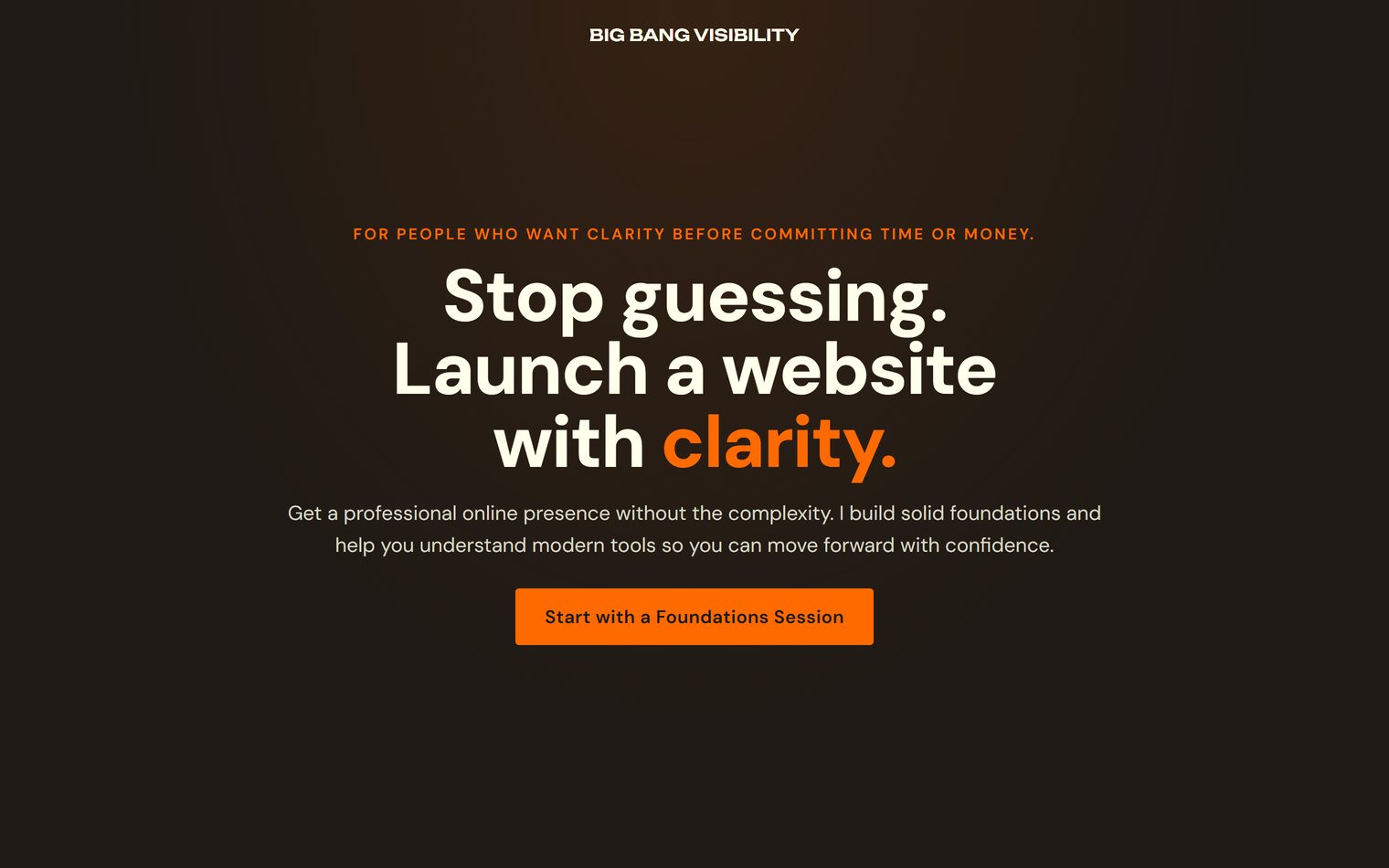
Big Bang Visibility services landing page with tiered pricing, plain-language copy, and a clarity-first single-column layout.
Landing Page

Starter Website Packages

Small business owners | First web presence

This is the page for my own business, and it reflects the same principles I bring to every project. Clear structure, plain language, and a layout designed to guide you from curiosity to a confident next step. It's thoughtful without being overwhelming, giving you the information you need without pressure. Built to the same rigorous code standards as my concept work, it stays focused on one simple goal: helping you get your project started with clarity and confidence.

  • Transparent pricing with a clear, tiered breakdown of services.
  • Clarity-first layout that answers questions before they need to be asked.
  • Designed with the practical needs of small business owners in mind.
View Starter Packages